· 8 minute read

Data Distribution, Histogram, and Density Curve: A Practical Guide
· · 9 minute read
Introduction
Whenever we come across a new collection of data, we first want to summarize the data and extract its general characteristics, such as:
- How are the values distributed across the data range?
- How frequently do different values occur?
- What are the most common or average values?
- Does the data contain any extreme values (outliers)?
This post will explore how Data Distribution can help you answer these questions.
You’ll also gain invaluable practical skills. You’ll learn to visualize a distribution as Histogram, Line Plot, and Density Curve using Python, Numpy, Matplotlib, and Seaborn.
What is Data Distribution?
Data distribution sorts a variable’s values from lowest to highest, then counts how many times each value occurs.
You’ll find data distributions everywhere. Even online retailers use distributions to help you decide whether to buy a product!
Imagine you’re looking for new running shoes. You find a pair on Amazon which has below customer rating distribution:
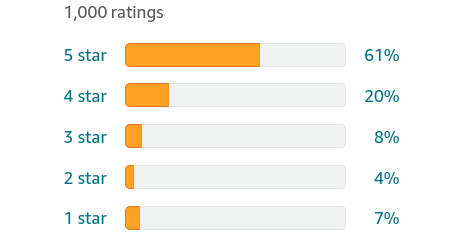
The plot reveals a wealth of information:
- All possible values: There are only five distinct values for the customer ratings (stars): 1, 2, 3, 4, and 5.
- Sorted: The order in which the rating values appear in the distribution is important. That’s why the values are sorted from 1 (lowest) to 5 (highest).
- Frequency: You can see how many times each of the values occur.
- Distribution shape: The orange bars show how the values are spread out. The frequency drops as we go down from 5 stars to 2 stars. Then there’s a slight uptick in 1-star ratings.
In the above example, the customer rating is a categorical variable with only five possible values. It’s easy to count the frequency of each value and prepare the data distribution.
But what if the data contains a continuous numerical variable? Such variables can have an infinite number of possible values. How can you create a distribution for them?
I’ll address this question in the rest of the post. Read on!
Continuous Numerical Data
We’ll work with the high school heights dataset. It’s an artificially generated dataset that contains the height measurements (in inches) of 1000 high school students.
Let’s load it and look at its summary statistics:
import pandas as pd
# read csv file
heights = pd.read_csv("hs_heights.csv")
# dataset has only one column
# So use squeeze() to ensure we get a pandas Series back
heights = heights.squeeze()
# get summary statistics
heights.describe().round(2)
count 1000.00
mean 64.57
std 3.63
min 56.68
25% 61.84
50% 64.20
75% 67.16
max 77.15
Name: 0, dtype: float64The height varies from 56.68 to 77.15 inches. But we have no clue how its values are spread out within the range.
Are most of the values clustered around the mean (64.67 inches)? Or are they scattered evenly across the range?
We need to look at heights distribution to answer these questions.
There’s a problem, though. Height is a continuous numerical variable. It can take on any value between 56.68 to 77.15. It’ll be impossible to measure frequency for each of these infinite values.
So what do we do?
We can divide the entire range into multiple intervals (or bins) of equal size. And calculate each bin’s frequency count (number of values that fall in a bin).
Allow me to illustrate this with the heights data.
Frequency Table
Let’s create multiple bins of equal width (2.5 inches). The first bin starts at 55 inches, and the last bin ends at 77.5 inches. That’ll cover all the values from our heights dataset.
We’ll use Numpy’s histogram() to prepare the bins and their frequency counts:
import numpy as np

bin_counts, bin_edges = np.histogram(
    # the data we want to split into bins and count frequency
    heights,
    # starting edges for the bins
    bins=[55, 57.5, 60, 62.5, 65, 67.5, 70, 72.5, 75, 77.5]
)
The function will return two lists:
- bin_counts: contains the count of values that fall in each bin.
- bin_edges: has the starting edge for each bin. Each value also acts as the ending point of the previous bin.
We can convert the output of Numpy’s histogram() into a pandas DataFrame as below:
pd.DataFrame({
    # bin_edges contains the starting value of the bin
    "Bin Start": bin_edges[:-1],
    # the subsequent value has bin's ending value
    "Bin End": bin_edges[1:],
    # Number of values in each bin
    "Frequency": bin_counts
})| Bin Start | Bin End | Frequency | |
|---|---|---|---|
| 0 | 55.0 | 57.5 | 9 |
| 1 | 57.5 | 60.0 | 82 |
| 2 | 60.0 | 62.5 | 231 |
| 3 | 62.5 | 65.0 | 255 |
| 4 | 65.0 | 67.5 | 196 |
| 5 | 67.5 | 70.0 | 149 |
| 6 | 70.0 | 72.5 | 60 |
| 7 | 72.5 | 75.0 | 15 |
| 8 | 75.0 | 77.5 | 3 |
The above output is known as the Frequency Table. No surprise there!
Histogram
A histogram displays the frequency of all possible values as a bar chart. Thus its the visual equivalent of the Frequency Table.
Let’s plot Histogram using Seaborn’s histplot(). We can pass the same parameters we used for Numpy’s histogram().
# Load visualization libraries
import matplotlib.pyplot as plt
import seaborn as sns

# Set Seaborn theme for all the plots
sns.set_theme(style='whitegrid', font_scale = 1.75)

plt.figure(figsize=(16, 10)) # set figure size

# Draw histogram
sns.histplot(
    # the data points
    x=heights,
    # Pass explicit bin edges
    bins=[55, 57.5, 60, 62.5, 65, 67.5, 70, 72.5, 75, 77.5]
)

# set x and y axis labels
plt.xlabel("Height (inches)", labelpad=20)
plt.ylabel("Count", labelpad=20)

plt.show()
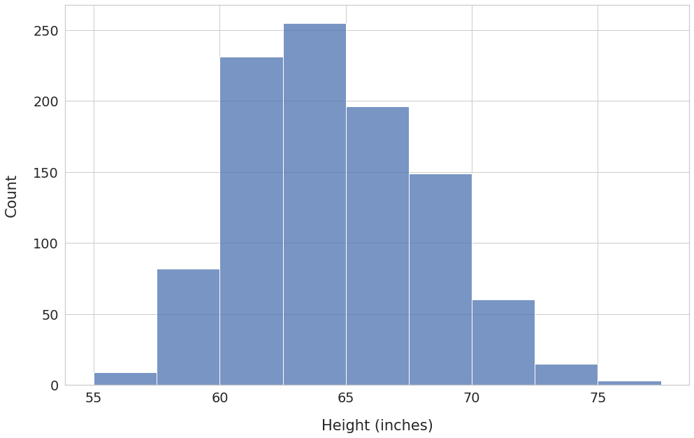
The x-axis shows the bins, and the y-axis has the corresponding frequency count.
Here are the key observations:
- The bin with edges 62.5 - 65.0 has the highest frequency. Over 250 students have heights in this range.
- The frequency count decreases as you move away from the bin 62.5 - 65.0 in either direction. Thus, most values are clustered around the middle of the distribution.
We’ll be able to see additional details if we increase the number of bins.
Let’s set the parameter bins to 50.1 The function histplot() will automatically create 50 intervals of equal width.
plt.figure(figsize=(16, 10))
sns.histplot(x=heights, bins=50)

plt.xlabel("Height (inches)", labelpad=20)
plt.ylabel("Count", labelpad=20)
plt.show()
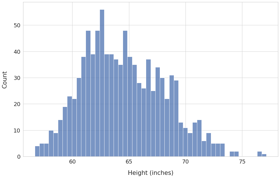
We can now see frequency counts at a much granular level. Having a large number of bins has also unearthed some new details.
For example, we can see a few outliers at around 76-77 inches. You might want to double-check: are they genuine values? Or could they be the result of an error in reporting or measurement?
Histogram with Density on the Y-Axis
So far, we’ve drawn histograms where the y-axis shows the count of values for each bin.
What if you want to switch to probability instead of absolute count?
Imagine that the area of the histogram (the sum of the areas of all the bars) represents the total probability for the high school heights variable.
We know that the total probability is always 1. Therefore, the area under the histogram must be equal to 1 as well. We’ll need to adjust the bin frequency (shown on the y-axis) accordingly. The adjusted frequency is called density.
Let’s redraw histogram by setting the parameter stat to density:
plt.figure(figsize=(16, 10))
ax = sns.histplot(
    x=heights,
    bins=50,
    # calculate and plot density so that
    # total area under histogram is 1
    stat='density'
)

plt.xlabel("Height (inches)", labelpad=20)

ax.tick_params(axis='y', colors='red')
plt.ylabel("Density", labelpad=20, color='red')

plt.show()
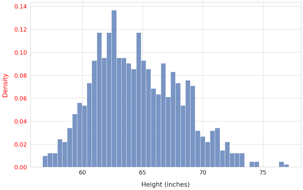
Notice that the shape of the distribution didn’t change. However, the y-axis ticks (in red) now show the bin density instead of absolute counts.
We’ll use density as the frequency measure for the rest of the post.
Line Plot
You can visualize data distribution as a Line Plot by connecting the top of consecutive Histogram bars.
To do so, you’ll need to find a point corresponding to each bar. The midpoint of the bar’s edge values will be the x-component of the point. The height of the bar will serve as the y-component.
For example, consider a histogram bar with bin edges 60 and 65. The midpoint of the bin edges is 62.5. And let’s say its height is 200. Thus we’ll use the point (62.5, 200) for the line plot.
Once you’ve found points for all the bars, draw a straight line between successive points:
plt.figure(figsize=(16, 10))

# Code reused from https://stackoverflow.com/a/49389122

# Use matplotlib hist() instead of Seaborn histplot()
# hist() returns info required to find points for line plot:
# 'n' - bin frequency (bar height)
# 'bins' - bin boundaries
n, bins, patches = plt.hist(
    x=heights,
    bins=50,
    density=True,
    alpha=0.2 # faded histogram
)

# find bin midpoints
bin_centers = 0.5*(bins[1:]+bins[:-1])
# draw lines connecting successive points
plt.plot(bin_centers, n, linewidth=3)

plt.xlabel("Height (inches)", labelpad=20)
plt.ylabel("Density", labelpad=20)
plt.show()
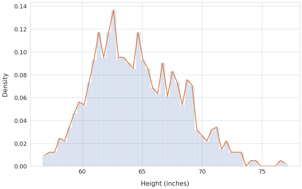
The line plot works better than histogram at showing trends for a given data range. We can see how the frequency (density) varies across the bins.
Density Curve
The above line plot has sharp edges at the bin midpoints where a line meets the next.
That’s because we’ve relied on only one sample of 1000 high school students. A single randomly drawn sample may not capture the true nature of the heights distribution.
Moreover, we’ve used a relatively low number of bins (50).
Imagine if you could do below instead:
- Measure heights of the entire population of high school students
- Use an extremely large number of bins (think 100,000 or even millions!)
With these changes, the line plot will become a smooth curve without any edges. This curve is known as the density curve.
You can draw the density curve using Seaborn’s kdeplot() function:
plt.figure(figsize=(16, 10))

# Plot histogram for reference
histogram = sns.histplot(
    heights,
    bins=50,
    stat='density',
    alpha=0.2 # faded histogram
    )

# Plot density curve
density_curve = sns.kdeplot(heights, linewidth=3)


plt.xlabel("Height (inches)", labelpad=20)
plt.ylabel("Density", labelpad=20)
plt.show()
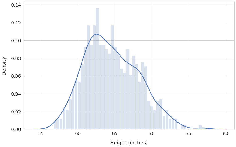
The density curve covers all possible data values and their corresponding probabilities. Hence the total area under the density curve will always be equal to 1.
This area property of the density curve plays a crucial role in Statistics and Machine Learning. We’ll explore it further in the next post.
Summary & Next Steps
We covered a lot of theory and related hands-on skills today. Let’s do a quick recap!
You are now familiar with Data Distribution. And understand how it helps us discover trends and patterns in the data.
You’ve learned to visualize distribution using multiple graphs - Histogram, Line Plot, and Density Curve.
You’ve also acquired considerable practical skills. You should now be able to use Numpy, Pandas, Matplotlib, and Seaborn to create and plot distributions.
If you want to build upon this knowledge, read the follow-up post where I discuss Area under the Density Curve.
Footnotes
-
The parameter
binsis quite versatile. If you set it to a list, the functions histogram() and histplot() will treat the list items as the bin edges. If you setbinsto an integer N, the functions will create N number of equal-width bins. ↩