· 9 minute read
Area Under Density Curve: How to Visualize and Calculate Using Python
· · 8 minute read
What makes Density Curves wildly popular in Statistics and Machine Learning? Hint: it's all about the area under them!
Introduction
We covered Data Distribution and Density Curve in a recent post.
This post focuses on the Area Under Density Curve. You’ll learn:
- What does the area under the curve represent?
- How can you use it in practical applications involving probabilities and percentiles?
- How to plot and calculate areas using Matplotlib, Seaborn, and Numpy?
Density Curve: A Quick Recap
A density curve is a graphical plot showing the probabilities associated with different values of a variable.
The x-axis of the density curve displays all the possible values. These values are sorted in increasing order. The y-axis shows the probabilities for the values on the x-axis.
Let’s illustrate it with the high school heights dataset. It’s a fake dataset with height measurements (in inches) of 1000 high school students.
Below code loads the data using pandas and draws the density curve using Seaborn’s kdeplot() function:
# Load pandas
import pandas as pd
# Load visualization libraries
import matplotlib.pyplot as plt
import seaborn as sns

# read csv file
heights = pd.read_csv("hs_heights.csv")
# dataset has only one column
# So use squeeze() to ensure we get a pandas Series back
heights = heights.squeeze()

# Set style and font scale using Seaborn
sns.set_theme(style='whitegrid', font_scale = 1.75)
# set figure size
plt.figure(figsize=(16, 10))

# Draw Density Curve
# fill=True shades the area under the curve
sns.kdeplot(heights, linewidth=2, fill=True)

# Vertical line at the peak value - for reference
plt.axvline(x=62.5, linewidth=3, color='red', linestyle='--')

# title & labels
plt.title("FIG 1. Density Curve for High School Heights", pad=20)
plt.xlabel("Height (inches)", labelpad=20)
plt.ylabel("Probability", labelpad=20)
plt.show()
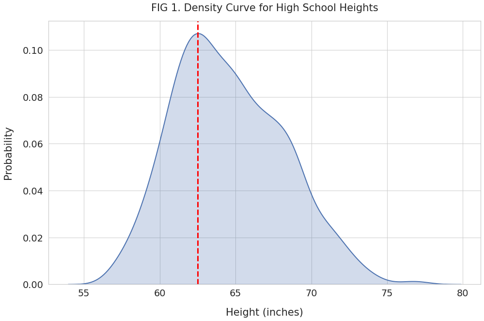
As expected, the x-axis has the heights sorted from the shortest to the tallest. And the y-axis shows the probability for those heights.
The density curve gives us a clear picture of how heights are spread out.
We can see in FIG 1 that the heights distribution peaks at 62.5 inches (red line). The frequency decreases as the height move away from the peak value, either to the left or the right. Thus the most frequent heights are clustered around 62.5 inches.
Area Under Density Curve
We know that the sum of probabilities for a variable is 1. And as mentioned earlier, the density curve shows the probabilities for all the values of a variable.
Therefore, the total area under the density curve always equals 1.
This simple fact is immensely useful and has many practical applications.
Imagine if someone asks you - what percentage of data values fall within a specific interval. You can answer such queries by measuring the partial area under the curve.
Let’s explore a few such examples with our heights dataset!
Area Above a Specific Value
Suppose you want to know:
What percentage of high school students are taller than five feet?
We’ll first highlight the region that represents heights taller than 5 feet (60 inches). Here’s how we’ll do it:
- Draw the density curve using kdeplot(). Note that it plots the curve by drawing a large number of thin vertical strips.
- Use Numpy mask to select the subset of strips for the region we’re interested in.
- Shade the region using Matplotlib’s fill_between() function.
plt.figure(figsize=(16, 10))

# Draw the density curve with it's area shaded
sns.kdeplot(heights, linewidth=2, fill=True)
# Invoke kdeplot() again to get reference to axes
ax = sns.kdeplot(heights)

# Below code to shade partial region is from
# https://stackoverflow.com/a/49100655

# Get all the lines used to draw the density curve
kde_lines = ax.get_lines()[-1]
kde_x, kde_y = kde_lines.get_data()

# Use Numpy mask to filter the lines for region
# reresenting height greater than 60 inches
mask = kde_x > 60
filled_x, filled_y = kde_x[mask], kde_y[mask]

# Shade the partial region
ax.fill_between(filled_x, y1=filled_y)

# vertical line at x = 60 for reference
plt.axvline(x=60, linewidth=3, linestyle='--')

plt.title("FIG 2. Partial Area: Taller Than 5 Feet", pad=20)
plt.xlabel("Height (inches)", labelpad=20)
plt.ylabel("Probability", labelpad=20)
plt.show()
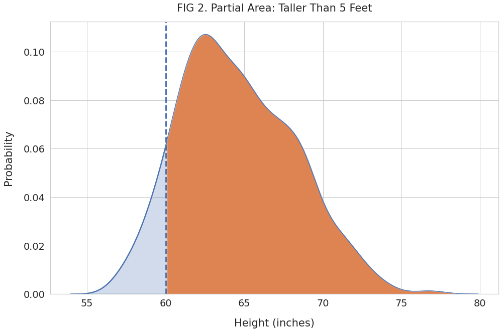
We can see the partial region shaded in orange. It represents the probability for heights of 60 inches and above.
Let’s find its area using Numpy’s trapz(). This function will add up the area of the thin strips that make up the orange region.
import numpy as np

# Area of the orange region (66 inches & above)
area = np.trapz(filled_y, filled_x)

print(f"Probability of heights higher than 60 inches: {area.round(4)}")
Probability of heights higher than 60 inches: 0.895The total area under the curve equals 1, and the shaded region has an area of 0.895. Thus it represents 89.5% of all possible height measurements.
Thus, we can say that 89.5% of high school students are taller than five feet.
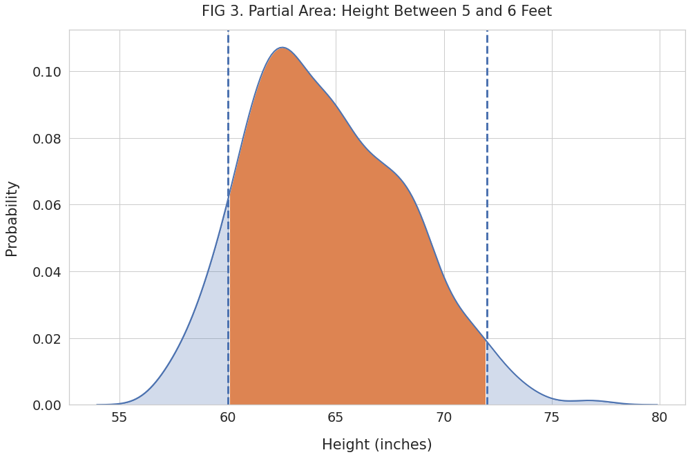
Area Between Two Values
You can use the density curve to find the percentage of data points that fall within two given values.
For example, let’s calculate how many students have heights between 5 and 6 feet. Here’s how we can visualize this population:
plt.figure(figsize=(16, 10))

# Plot density curve
sns.kdeplot(heights, linewidth=2, fill=True)
ax = sns.kdeplot(heights)

# Get all the lines used to draw density curve
kde_lines = ax.get_lines()[-1]
kde_x, kde_y = kde_lines.get_data()

# Filter for height between 5 feet (60 inches) & 6 feet (72 inches)
mask = (kde_x > 60) & (kde_x < 72)
filled_x, filled_y = kde_x[mask], kde_y[mask]

# Shade the partial region
ax.fill_between(filled_x, y1=filled_y)

# Vertical lines at 5 and 6 feet for reference
plt.axvline(x=60, linewidth=3, linestyle='--')
plt.axvline(x=72, linewidth=3, linestyle='--')

plt.title("FIG 3. Partial Area: Height Between 5 and 6 Feet", pad=20)
plt.xlabel("Height (inches)", labelpad=20)
plt.ylabel("Probability", labelpad=20)
plt.show()
And use Numpy’s trapz() to calculate the area of the shaded region:
area = np.trapz(filled_y, filled_x)
print(f"Fraction of heights between 5 and 6 feet: {area.round(4)}")
Fraction of heights between 5 and 6 feet: 0.8638Thus we can conclude that a little over 86% of the high school students are taller than 5 feet but shorter than 6 feet.
Percentile
Percentile is a popular measure to compare how a given value fares against other observations.
The Nth percentile is the value that is greater than the N percent of all data points. For example, if you scored 95th percentile in an exam, 95% of students who took the exam would have scored lower than you.
Let’s calculate the percentile for a value from our heights dataset.
Suppose one of the students, Monica, has a height of 69.8 inches. Is she too tall or too short for a high school student?
We can’t answer that question by looking at her height alone. We’ll need to compare her with everyone else in the dataset.
Let’s plot the density curve and shade the region below her height:
plt.figure(figsize=(16, 10))

# Plot density curve
sns.kdeplot(heights, linewidth=1, fill=True)
ax = sns.kdeplot(heights, linewidth=2)

# Get lines used to draw density curve
kde_lines = ax.get_lines()[-1]
kde_x, kde_y = kde_lines.get_data()

monica_height = 69.8

# Filter and shade the region with for heights
#  less than monica's
mask = kde_x < monica_height
filled_x, filled_y = kde_x[mask], kde_y[mask]
ax.fill_between(filled_x, y1=filled_y)

# vertical line for reference
plt.axvline(x=monica_height, linewidth=3, linestyle='--')

plt.title("FIG 4. Partial Area: Shorter Than 69.8 Inches", pad=20)
plt.xlabel("Height (inches)", labelpad=20)
plt.ylabel("Probability", labelpad=20)
plt.show()
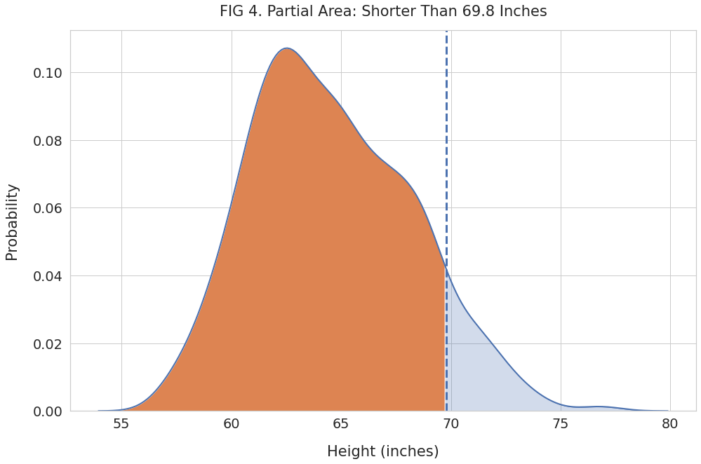
Next, find the area of the shaded region and convert it to a percentage:
# area of the orange region
area = np.trapz(filled_y, filled_x)
# convert to percentage
pct = (area*100).round(2)
print(f"Percent of heights below {monica_height} inches: {pct}%")
Percent of heights below 69.8 inches: 90.35%Over 90% of high school students are shorter than Monica. We can report this as the percentile in two ways:
- 69.8 inches is the 90th percentile height for all high school students
- Monica’s height (69.8 inches) puts her in the 90th percentile of all high school students.
Summary & Next Steps
Today you learned about the area under density curve. You know how to interpret partial regions under the curve and find probabilities associated with specific data intervals.
Now you are familiar with percentile. And how to calculate it using the density curve.
You picked up considerable hands-on skills as well. You can plot density curves, highlight partial regions, and find their areas using Python, Matplotlib, Seaborn, and Numpy.
If you want to take your knowledge to the next level, read the following post that shows how to generate normal distributions using SciPy.