· 9 minute read
Draw Dot Plot Using Python and Matplotlib
· · 6 minute read
What is Dot Plot?
A dot plot is a simple graph that uses solid circles, or dots, to show the frequency of each unique data value.
Let’s illustrate it with an example. Suppose a group of 23 people participated in a 10K race. The below list has their finish times (in minutes):
57, 59, 56, 54, 56, 59, 60, 62, 61, 59, 60, 59, 55, 60, 56, 58, 58, 59, 61, 58, 58, 57, 54
We can count the number of runners for each unique finish time:
| Finish Time | 54 | 55 | 56 | 57 | 58 | 59 | 60 | 61 | 62 |
|---|---|---|---|---|---|---|---|---|---|
| Runners | 2 | 1 | 3 | 2 | 4 | 5 | 3 | 2 | 1 |
And draw a dot plot to visualize this information:
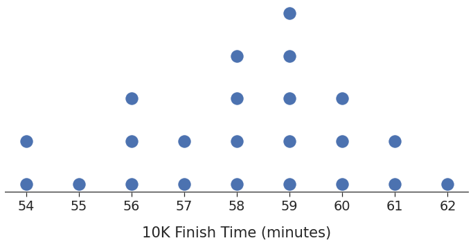
You can get the frequency of a finish time by counting the dots corresponding to it. Two runners completed the race in 54 minutes, only one took 55 minutes, three finished in 56 minutes, and so on.
Now that you know what dot plots are, let me show you how to draw them.
The dotplot() function
Matplotlib is the most popular Python library for visualization. But it doesn’t have a native function for dot plots.
No need to worry, though! You can use the below dotplot() function. It’ll draw dot plots for any given list of numbers (passed in as input_x):
# standard numpy and matplotlib library imports
import numpy as np
import matplotlib.pyplot as plt

def dotplot(input_x, **args):

    # Count how many times does each value occur
    unique_values, counts = np.unique(input_x, return_counts=True)

    # Convert 1D input into 2D array
    scatter_x = [] # x values
    scatter_y = [] # corresponding y values
    for idx, value in enumerate(unique_values):
        for counter in range(1, counts[idx]+1):
            scatter_x.append(value)
            scatter_y.append(counter)

    # draw dot plot using scatter()
    plt.scatter(scatter_x, scatter_y, **args)

    # Optional - show all unique values on x-axis.
    # Matplotlib might hide some of them
    plt.gca().set_xticks(unique_values)
Here’s how this function works:
- It transforms the given list
input_xinto a 2D array. - It counts how many times each unique value occurs and creates as many 2D points. For example, if the value 60 appears three times, we’ll have three 2D points - (60, 1), (60, 2), and (60, 3).
- Finally, it uses Matplotlib’s
scatter()and the 2D array to draw the dot plot. - Notice that the function passes all the inputs (
**args) toscatter(). Thus, you can customize the dot plot using any parameters that work withscatter().
Let’s see a few ways in which you can use this function.
Example 1: dotplot() in Action
Suppose the below list contains the heights (in inches) of 50 high school basketball players:
hs_heights = np.array([
    71, 67, 64, 72, 65, 69, 66, 68, 69, 72,
    69, 73, 69, 72, 73, 74, 76, 68, 66, 63,
    67, 71, 72, 74, 68, 69, 75, 71, 72, 72,
    65, 66, 72, 74, 66, 62, 75, 75, 64, 63,
    64, 66, 74, 67, 72, 70, 71, 70, 74, 68
])
How frequently does each height measurement occur? We can find the answer by drawing the dot plot:
# Draw dot plot using our new function
dotplot(input_x=hs_heights) 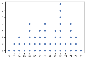
We have a basic dot plot that shows the distribution of heights. But the graph is too small and too bland. Let’s jazz it up.
Remember, we can use any argument available in scatter(). So here’s what we’ll do:
- Use the parameter
markerto draw stars (★) instead of dots (●). You can use any of the Matplotlib markers. - Change the marker color using the parameter
color. - The parameter
scontrols the marker size. Let’s set it to 100. - Make the plot bigger and sharper using Matplotlib’s
figure().
# dpi - controls sharpness
plt.figure(figsize=(10, 6), dpi=150)

dotplot(input_x=hs_heights, marker='*', color='#C44E52', s=100)

plt.xlabel("Height (Inches)", fontsize=14, labelpad=15)
plt.ylabel("Number of Players", fontsize=14, labelpad=15)
plt.title("High School Basketball Players", fontsize=14, pad=15)
plt.show() 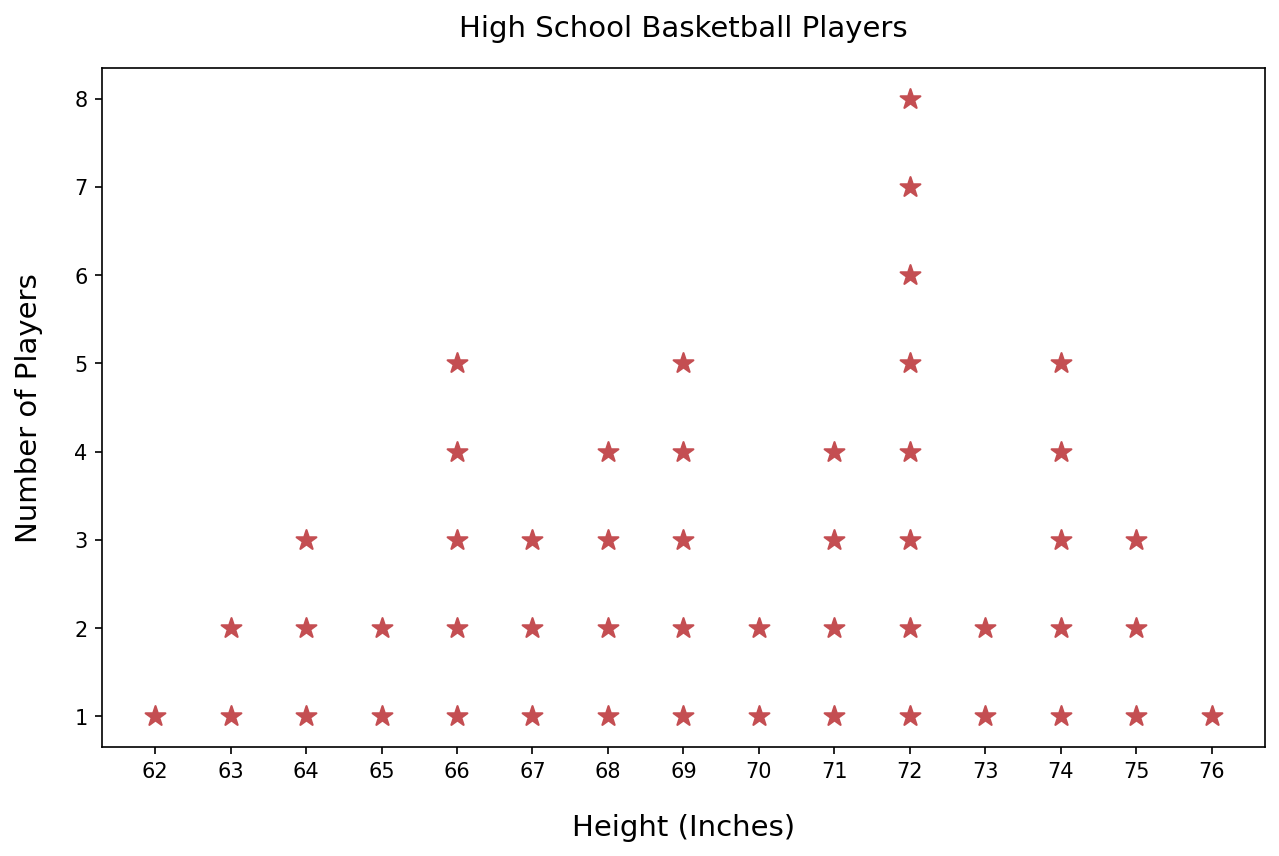
Example 2: Without Frame or Y-Axis
You might have seen dot plots without the rectangular frame around them. Sometimes the y-axis is omitted as well. Let’s learn how to do that using our dotplot() function.
Suppose the list below contains students’ scores for a high school final exam. And we want to know how these scores are distributed.
exam_scores = np.array([
    82, 82, 76, 84, 76, 82, 79, 83, 75, 78,
    85, 77, 78, 82, 77, 86, 87, 76, 77, 86,
    85, 78, 86, 77, 78, 84, 79, 78, 75, 85,
    85, 86, 78, 83, 84, 82, 78, 77, 82, 85
])
The below code visualizes the exam scores as a dot plot without the frame or y-axis:
# Seaborn for better styling
import seaborn as sns
# Line2D will be needed to draw x-axis line
from matplotlib.lines import Line2D

# Use seaborn to scale up font size
sns.set_theme(style="ticks", font_scale=1.75)
# Dimensions of the plot
plt.figure(figsize=(20, 8))

# Draw the dot plot
dotplot(input_x=exam_scores, s=400, color='#0054A6')

axes = plt.gca()
# Remove the rectangle around the plot
axes.set_frame_on(False)
# Remove y-axis values
axes.axes.get_yaxis().set_visible(False)

# Removing frame also removed x-axis line
# let's add it back
xmin, xmax = axes.get_xlim()
ymin, ymax = axes.get_ylim()
xaxis_line = Line2D(
    (xmin, xmax), (ymin, ymin), linewidth=2, color='black'
)
axes.add_artist(xaxis_line)

# No one scored 80 or 81. So Matplotlib won't show these
# two values on the x-axis
# Below code ensures that every possible value in the score
# range is visible on the x-axis
score_range = range(exam_scores.min(), exam_scores.max()+1)
axes.set_xticks(score_range)

plt.xlabel("Final Exam Scores", labelpad=20)
plt.show() 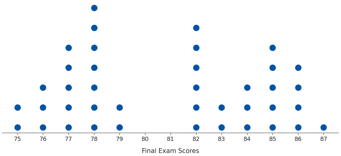
The plot looks cleaner without the surrounding box and the y-axis.
You can experiment as per your needs. For example, what if you want to keep the y-axis? You could draw it using Line2D, as we did above for the x-axis.
Example 3: Multicolored Dot Plot
This one is strictly for fun 😀.
So far, we’ve been drawing dots with the same color. But you can specify a different color for each dot.
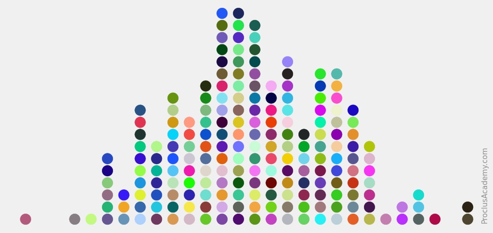
Let’s visualize the heights of basketball players again. We’ll generate random colors using NumPy’s default_rng and draw a colorful dot plot:
# import random number generator
from numpy.random import default_rng

# Get random colors
rng = default_rng()
# We need colors for all data points
# And each color consists of 3 numbers (RGB)
# Hence input size = (hs_heights.size, 3)
random_colors = rng.random(size=(hs_heights.size, 3))

# Set seaborn style and plot size
sns.set_theme(style='ticks')
plt.figure(figsize=(10, 6), dpi=150)

# draw dot plot
# Set random colors using the 'color' parameter
dotplot(input_x=hs_heights, s=200, color=random_colors)
plt.show() 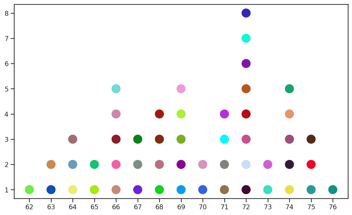
Summary & Next Steps
Matplotlib doesn’t support dot plots natively. So we wrote our own function to draw dot plots. This post also showed you how to customize these plots with various options - the dot shape, size, color, axes lines, etc.
The dot plot is a great tool to visualize the distribution of smaller datasets. But you’ll need different techniques and graphs to handle larger datasets. You can read all about that here.