· 11 minute read

React Essentials III: How To Define & Use Components
· · 9 minute read
Introduction
We recently learned how to create a new React project using Vite. In this tutorial, we’ll take a closer look at the components - the basic building blocks of a React app.
I’ll first explain the concept of a component using a practical example. Then, I’ll cover how to:
- Define a component as a function or class.
- Pass props to a component.
- Set default prop values.
- Reuse components to compose UIs.
- Specify and enforce the data types for the props.
Let’s get started!
What is a Component?
React lets you split a user interface (UI) into smaller chunks called components. Each component encapsulates a specific piece of functionality and can be developed independently.
Let me illustrate this with an example.
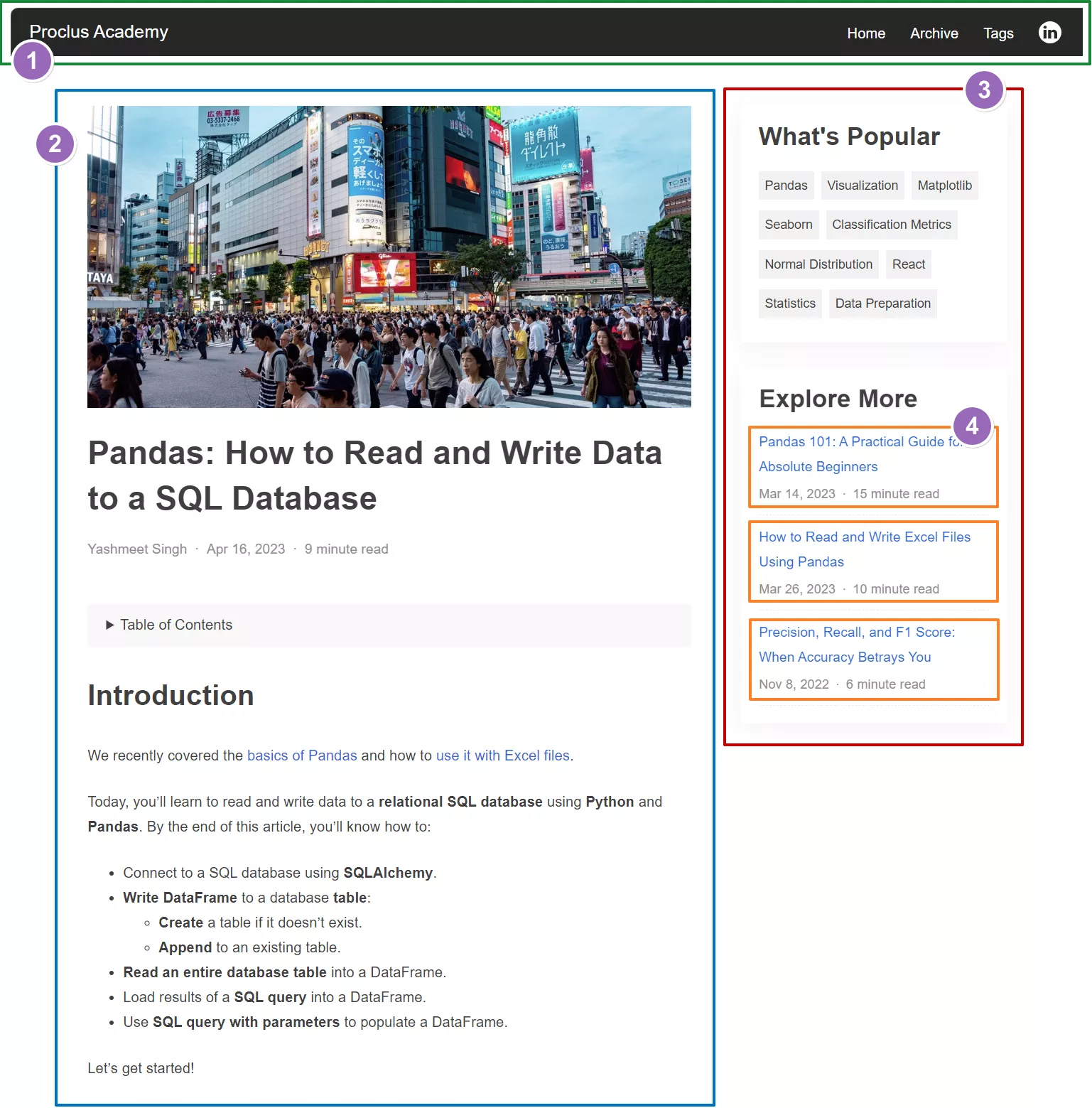
The below screenshot shows an article from this site. Like most web pages, it contains visually distinct sections such as 1 top navigation, 2 main content area, and 3 sidebar.
You can create React components to represent each of these sections. These components will contain all the code (HTML, CSS, etc) and the logic required to render each section. Finally, you’ll combine these components to build the entire page.
Reusable Components
The component-based approach gives you a significant advantage when your UI contains recurring elements.
Notice that the sidebar in the above screenshot contains a list of related articles (4). With React, you can create a “RelatedArticle” component once and use it repeatedly to render the articles list.
Even though related articles have similar UI, their content differs - each article has a distinct title, publication date, etc. You can pass such properties to a component and change its content dynamically. We’ll see this in action as well.
Defining React Components
Naming Conventions
Generally, React components are defined in files with extension .js or .jsx (or .tsx if you’re using TypeScript). Moreover, the file has the same name as the component it defines.
Let’s follow this convention and create a new file, RelatedArticle.jsx, for the RelatedArticle component.
There are three ways to define a component in React:
- Functional Component - as a regular JavaScript function.
- Functional Component - using ES6 arrow syntax.
- Class Component.
Let’s see how to use each of these approaches.
Functional Component - Regular JavaScript Function
The below code defines the component as a standard JavaScript function. The function must return JSX that’ll render the UI.
We’ll use one of the related articles from the screenshot and show its title, publication date, and the time to read1:
RelatedArticle.jsx
// Define the component as a regular JavaScript Function
function RelatedArticle() {

  // Return JSX code
  return (
    <div className="related-article">
      <div className="title">
        How to Read and Write Excel Files Using Pandas
      </div>
      <span className="pub-date">Mar 26, 2023</span>
      <span className="read-time">10 minute read</span>
    </div>
  );
}

// Export so the component is available
// to the rest of your app
export default RelatedArticle;
Learn how to write JSX like an expert: React Essentials II: A Practical Guide to JSX
Functional Component - ES6 Arrow Function
You can use the arrow function expression to define the component more concisely. Here’s the same RelatedArticle component written as an arrow function:
RelatedArticle.jsx
// Define the component using ES6 arrow function syntax
const RelatedArticle = () => {

  // Return JSX code
  return (
    <div className="related-article">
      <div className="title">
        How to Read and Write Excel Files Using Pandas
      </div>
      <span className="pub-date">Mar 26, 2023</span>
      <span className="read-time">10 minute read</span>
    </div>
  );
};

// Export so the component is available
// to the rest of your app
export default RelatedArticle;
Class Component
Defining components as a class was popular many years ago. However, class components fell out of favor after React allowed Hooks in functional components.
Most likely, you’ll never have to write class components. But if you ever have to, this is how you’ll do it:
RelatedArticle.jsx
// import the React Component class
import { Component } from "react";

// Define component by extending the Component class
export class RelatedArticle extends Component {

  // implement render() method and return JSX from it
  render() {
    return (
      <div className="related-article">
        <div className="title">
          How to Read and Write Excel Files Using Pandas
        </div>
        <span className="pub-date">Mar 26, 2023</span>
        <span className="read-time">10 minute read</span>
      </div>
    );
  }
}

// Export so the component is available
// to the rest of your app
export default RelatedArticle;
We’ll stick with functional components using the arrow syntax for the rest of the article.
Using the Component
Recall that the sidebar contains the related articles. We can reflect this structure in our component design as well.
Let’s write a new component to render the sidebar (Sidebar.jsx). And add the related article component as an HTML tag, <RelatedArticle />, in its JSX response.
Sidebar.jsx
// import the RelatedArticle component
import RelatedArticle from "./RelatedArticle";

// Create a new component to render the Sidebar
const Sidebar = () => {
  return (
    <div>
      <h2>Explore More</h2>
      {/* Add RelatedArticle component in the JSX */}
      <RelatedArticle />
    </div>
  );
};

export default Sidebar;
The above code instructs React to include the related article when it renders the sidebar.
Pass ‘props’ to Components
The RelatedArticle component we wrote above renders a specific article. We hardcoded the article properties - title, publication date, and read time.
We can pass these properties as inputs to our component. That’ll make our component reusable because it can render any related article.
React components accept props - an Object with key-value pairs. We can get the title, publication date, and read time from the props object, and embed them in the JSX like below:
RelatedArticle.jsx
// React will pass inputs as the props object
const RelatedArticle = (props) => {
  return (
    <div className="related-article">
      {/*
      Retrieve title, pubDate & readMinutes
      from the props object & plug them in JSX
      */}
      <div className="title">{props.title}</div>
      <span className="pub-date">{props.pubDate}</span>
      <span className="read-time">
        {props.readMinutes} minute read
      </span>
    </div>
  );
};

export default RelatedArticle;
Now you use this component, you can pass the article props as key-value pairs:
<RelatedArticle
  title="How to Read and Write Excel Files Using Pandas"
  pubDate="Mar 26, 2023"
  readMinutes="10"
/>
Destructure Props
When defining RelatedArticle above, we passed the props object and accessed each input prop using the dot notation (ex. props.title).
This dot notation can get tiresome, especially if your component has many props. Instead, you can destructure the props object and access the input prop directly:
RelatedArticle.jsx
// Destructure props
const RelatedArticle = ({ title, pubDate, readMinutes }) => {
  return (
    <div className="related-article">
      <div className="title">{title}</div>
      <span className="pub-date">{pubDate}</span>
      <span className="read-time">
        {readMinutes} minute read
      </span>
    </div>
  );
};

export default RelatedArticle;
Reusing Components
React’s component-based design encourages developers to write a component once and reuse it throughout the application. Let’s see this action.
Recall that the sidebar shows multiple related articles. The code below shows the updated Sidebar component, which includes RelatedArticle twice.
Each invocation supplies different input props. That’ll add two different articles to the sidebar:
import RelatedArticle from "./RelatedArticle";

const Sidebar = () => {
  return (
    <div>
      <h2>Explore More</h2>
      {/*
        Reuse RelatedArticle component to render
        multiple articles
      */}
      <RelatedArticle
        title="Pandas 101: A Practical Guide for Absolute Beginners"
        pubDate="Mar 14, 2023"
        readMinutes="15"
      />
      <RelatedArticle
        title="How to Read and Write Excel Files Using Pandas"
        pubDate="Mar 26, 2023"
        readMinutes="10"
      />
    </div>
  );
};

export default Sidebar;
We can enhance Sidebar further to make it dynamic.
Let’s pass it a list of related articles as a prop. Then iterate over the list in the JSX and render each article using the RelatedArticle component:
import RelatedArticle from "./RelatedArticle";

const Sidebar = ({ relatedArticles }) => {
  return (
    <div>
      <h2>Explore More</h2>
      {/*
        Iterate over the input list of articles and
        render each using the RelatedArtcle component
       */}
      {relatedArticles.map((article, idx) => (
        <RelatedArticle
          key={idx}
          title={article.title}
          pubDate={article.pubDate}
          readMinutes={article.readMinutes}
        />
      ))}
    </div>
  );
};

export default Sidebar;
Why does the above code use the key prop (key={idx})? You can read about it here.
Set default Prop Values
What if you want to set the default value for a prop - the value to be used if the prop is not passed? You can do that in the component definition by setting a value to the destructured prop.
The below code sets the default values for the RelatedArticles props - title, pubDate, and readMinutes:
RelatedArticle.jsx
const RelatedArticle = ({
  title = "This is a blog article",
  pubDate = "Jan 01, 2024",
  readMinutes = 8,
}) => {
  return (
    <div className="related-article">
      <div className="title">{title}</div>
      <span className="pub-date">{pubDate}</span>
      <span className="read-time">
        {readMinutes} minute read
      </span>
    </div>
  );
};

export default RelatedArticle;
Let’s see how React interprets the above definition.
The below code uses RelatedArtcle without any props. Therefore, React will render the component with default values for all the props:
{/* Use default values for all props */}
<RelatedArticle />
And the code below is missing one prop - readMinutes. So React will use it’s default value (8):
{/* Use default value of 'readMinutes' */}
<RelatedArticle
  title="How to Read and Write Excel Files Using Pandas"
  pubDate="Mar 26, 2023"
/>
Using defaultProps
There’s an alternative approach to set default prop values if you want to keep the component definition clean. You can use the component property defaultProps, like below:
RelatedArticle.jsx
const RelatedArticle = ({ title, pubDate, readMinutes }) => {
  return (
    <div className="related-article">
      <div className="title">{title}</div>
      <span className="pub-date">{pubDate}</span>
      <span className="read-time">
        {readMinutes} minute read
      </span>
    </div>
  );
};

// Set default prop values
RelatedArticle.defaultProps = {
  title: "This is a blog article",
  pubDate: "Jan 01, 2024",
  readMinutes: 8,
};

export default RelatedArticle;
It’ll have the same effect as the approach in the previous section.
Defining Prop Types
You may decide to enforce the data type for each prop. For example, we know that the article props should have the following types:
- title: string
- pubDate: Date
- readMinutes: number
How do you ensure that anyone using RelatedArticle must pass props with the above types?
The below code shows how to accomplish that:
- Import PropTypes from the prop-types package (line 2).
- Add a component property propTypes (line 16 - notice that it starts with lowercase p).
- Add the prop name and its data type using PropTypes (lines 17-20).
- Chain the type with isRequired if a prop must be passed (line 17). React will show a runtime warning if it’s missing.
RelatedArticle.jsx
// Import PropTypes
import PropTypes from "prop-types";

const RelatedArticle = ({ title, pubDate, readMinutes }) => {
  return (
    <div className="related-article">
      <div className="title">{title}</div>
      <span className="pub-date">{pubDate?.toDateString()}</span>
      <span className="read-time">{readMinutes} minute read</span>
    </div>
  );
};

// Define the type for each prop using PropTypes
// Add 'isRequired' flag if a prop must be passed
RelatedArticle.propTypes = {
  title: PropTypes.string.isRequired,
  pubDate: PropTypes.instanceOf(Date),
  readMinutes: PropTypes.number,
};

export default RelatedArticle;
Now you’ll get a warning about the missing title if you try to use RelatedArticle without passing any props:
<RelatedArticle />Warning: Failed prop type: The prop `title` is marked as required in `RelatedArticle`, but its value is `undefined`.
React will expect pubDate to be a Date object. So you’ll also get a warning if you try to set it as a string:
<RelatedArticle
  title="How to Read and Write Excel Files Using Pandas"
  pubDate="Mar 26, 2023"
/>
Warning: Failed prop type: Invalid prop `pubDate` of type `String` supplied to `RelatedArticle`, expected instance of `Date`.
The below code will work without any warnings. It passes the props with the expected data types:
<RelatedArticle
  title="How to Read and Write Excel Files Using Pandas"
  pubDate={new Date("Mar 26, 2023")}
  readMinutes={8}
/>
Summary & Next Steps
This tutorial provided an in-depth introduction to React components.
You learned how to define components and reuse them to build UIs. You can specify component props, set the default prop values, and define prop types.
I explained all of that using practical examples. You should be able to utilize these hands-on skills in your next React project.
In the upcoming articles, I’ll cover React hooks (useState, useEffect, etc.). So be sure to keep an eye out!
Footnotes
-
I didn’t define the CSS classes mentioned in the JSX code because the primary focus of this article is React components, not styling. You can implement these CSS classes and style the component as you like. ↩
Title Image by
StockSnap