· 6 minute read

Boxplot With Separate Y-Axis for Each Column
· · 5 minute read
Sometimes you want to draw boxplots where each column gets its own y-axis. Here's how you can do it.
Introduction
You’ll frequently work on datasets with multiple numerical columns. Boxplot is the best tool for you to visualize how each column’s values are distributed.
Ideally, you want to draw boxplots for all your inputs in one figure. You can do that using the boxplot() method from pandas or Seaborn.
But you’ll have a problem if your columns have significantly different scales.
The column with the largest scale will dominate the plot. You won’t be able to see much details for the smaller-scaled inputs.
Let’s see this issue in action. Then we’ll go over three ways to solve it:
- Using pandas’
plot() - Using pandas’
boxplot() - Using Seaborn’s
boxplot()
The Dataset
We’ll use the Taiwan real estate dataset:
import pandas as pd

data_df = pd.read_csv('taiwan_real_estate_partial.csv')

# get statistics for all columns
data_df.describe().loc[['min', 'max', 'mean', 'std']].round(2)| age | station_distance | stores_count | unit_price | |
|---|---|---|---|---|
| min | 0.00 | 49.66 | 0.00 | 12.20 |
| max | 43.80 | 6396.28 | 10.00 | 78.00 |
| mean | 19.36 | 1084.08 | 4.16 | 38.16 |
| std | 11.87 | 1365.53 | 2.80 | 13.59 |
The column station_distance has a much larger scale than other inputs. Its maximum value is over 6000, while all other columns stay under 100.
The Problem
Let’s draw a boxplot using pandas’ boxplot() method:
import matplotlib.pyplot as plt

plt.figure(figsize=(10, 6))
data_df.boxplot()
plt.show()
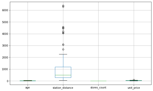
By default, boxplot() will use the same y-axis for all the inputs. Therefore, it’ll set the maximum value of the y-axis to 6396.28 to accommodate the column station_distance.
That’s why we can see how station_distance is spread out in great detail. Its median, outliers, and the box representing its IQR are clearly visible.
We don’t see such details for the other columns with significantly smaller scales. The scale for the y-axis is too large to show any variations for these columns. That’s why boxplot() pushes them to the bottom of the graph.
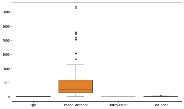
Seaborn’s boxplot() suffers from the same issue:
import seaborn as sns

plt.figure(figsize=(10, 6))
sns.boxplot(data=data_df)
plt.show()
The Solution
It would be great if we could draw boxplot where each column gets its own y-axis. That way, columns with larger scales won’t affect others visually.
There are a few ways to do that:
1. pandas’ plot()
Use pandas plot() with parameters kind='box' and subplots=True like below.
The parameter sharey is set to False by default. It works along with sbuplots=True to isolate the y-axis for each column.
data_df.plot(
    kind='box',
    subplots=True,
    sharey=False,
    figsize=(10, 6)
)

# increase spacing between subplots
plt.subplots_adjust(wspace=0.5)
plt.show()
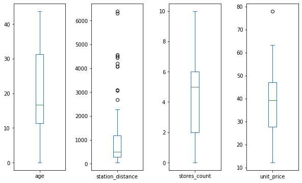
It looks much better! The boxplots for each column are independent of each other.
We can see details such as median, percentiles, IQR, and outliers for each column clearly.
2. pandas’ boxplot()
If you insist on using pandas’ boxplot() method, you’ll need to draw subplots yourself.
You can do that using matplotlib’s subplots() method like below.
# 4 subplots in one row
fig, ax = plt.subplots(1, 4, figsize=(10, 6))

# draw boxplots - for one column in each subplot
data_df.boxplot('age', ax=ax[0])
data_df.boxplot('station_distance', ax=ax[1])
data_df.boxplot('stores_count', ax=ax[2])
data_df.boxplot('unit_price', ax=ax[3])

plt.subplots_adjust(wspace=0.5)

plt.show()

Note: I expected the pandas’
boxplot()to work with the parameterssubplotsorsharey. But it didn’t. It doesn’t have these parameters1.try: data_df.boxplot(subplots=True, sharey=False, figsize=(12, 8)) except Exception as e: print(f'{type(e).__name__}: {e}')TypeError: Axes.boxplot() got an unexpected keyword argument 'subplots'
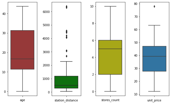
3. Seaborn’s boxplot()
You might want to use Seaborn for its beautiful styles. Unfortunately, its boxplot() method doesn’t recognize the parameters subplots or sharey.
Just like the previous solution, you’ll need to draw subplots yourself. Then use Seaborn’s boxplot() in each subplot.
# initialize figure with 4 subplots in a row
fig, ax = plt.subplots(1, 4, figsize=(10, 6))

# add padding between the subplots
plt.subplots_adjust(wspace=0.5)

# draw boxplot for age in the 1st subplot
sns.boxplot(data=data_df['age'], ax=ax[0], color='brown',)
ax[0].set_xlabel('age')

# draw boxplot for station_distance in the 2nd subplot
sns.boxplot(data=data_df['station_distance'], ax=ax[1], color='g')
ax[1].set_xlabel('station_distance')

# draw boxplot for stores_count in the 3rd subplot
sns.boxplot(data=data_df['stores_count'], ax=ax[2], color='y')
ax[2].set_xlabel('stores_count')

# finally draw boxplot for unit_price in the 4th subplot
sns.boxplot(data=data_df['unit_price'], ax=ax[3])
ax[3].set_xlabel('unit_price')

# by default, you'll see x-tick label set to 0 in each subplot
# remove it by setting it to empty list
for subplot in ax:
    subplot.set_xticklabels([])

plt.show()
There you have it! Now you know three ways to draw boxplots for inputs with significant differences in scales.
Next, check out how to prepare such inputs for your next machine learning project.
Footnotes
Title Image by
Hugo_ob