· 6 minute read

Accuracy and Confusion Matrix Using Scikit-Learn & Seaborn
· · 6 minute read
Introduction
In a previous post, we covered the basic metrics to evaluate classification models - Confusion Matrix and Accuracy. It’s time to apply that theory and gain practical experience.
In this post, we’ll use Python and Scikit-Learn to calculate the above metrics.
We’ll also learn how to visualize Confusion Matrix using Seaborn’s heatmap() and Scikit-Learn’s ConfusionMatrixDisplay().
Let’s take a look at the dataset we’ll use.
Pima Indians Diabetes Dataset
The dataset contains diagnostic records for 768 patients. Here’s the official description:
The objective of the dataset is to diagnostically predict whether or not a patient has diabetes..
The datasets consists of several medical predictor variables and one target variable,
Outcome. Predictor variables includes the number of pregnancies the patient has had, their BMI, insulin level, age, and so on.
So we’ll build a classification model to predict diabetes. And then measure the model’s expected performance.
Let’s start by importing the dataset:
import pandas as pd

dataset = pd.read_csv("diabetes.csv")
dataset.info()
<class 'pandas.core.frame.DataFrame'>
RangeIndex: 768 entries, 0 to 767
Data columns (total 9 columns):
# Column Non-Null Count Dtype
--- ------ -------------- -----
0 Pregnancies 768 non-null int64
1 Glucose 768 non-null int64
2 BloodPressure 768 non-null int64
3 SkinThickness 768 non-null int64
4 Insulin 768 non-null int64
5 BMI 768 non-null float64
6 DiabetesPedigreeFunction 768 non-null float64
7 Age 768 non-null int64
8 Outcome 768 non-null int64
dtypes: float64(2), int64(7)
memory usage: 54.1 KBThe column Outcome is the target variable. All of the other columns will be the inputs to our classification model.
Here’s a sample from the dataset:
dataset.sample(5, random_state=101)| Pregnancies | Glucose | BloodPressure | SkinThickness | Insulin | BMI | DiabetesPedigreeFunction | Age | Outcome | |
|---|---|---|---|---|---|---|---|---|---|
| 766 | 1 | 126 | 60 | 0 | 0 | 30.1 | 0.349 | 47 | 1 |
| 748 | 3 | 187 | 70 | 22 | 200 | 36.4 | 0.408 | 36 | 1 |
| 42 | 7 | 106 | 92 | 18 | 0 | 22.7 | 0.235 | 48 | 0 |
| 485 | 0 | 135 | 68 | 42 | 250 | 42.3 | 0.365 | 24 | 1 |
| 543 | 4 | 84 | 90 | 23 | 56 | 39.5 | 0.159 | 25 | 0 |
Training the Classification Model
First, separate the features from the output label:
X = dataset.drop(columns='Outcome')
y = dataset['Outcome']
Next, split train and test subsets. We’ll set aside 30% of the observations for testing:
from sklearn.model_selection import train_test_split

X_train, X_test, y_train, y_test = train_test_split(X, y, test_size=0.3)
Then fit a classification model on the training data. We’ll use AdaBoostClassifier with the default parameters.
Finally, use the trained model to predict output labels for the test inputs X_test.
from sklearn.ensemble import AdaBoostClassifier

# initialize and fit model on the training set
model = AdaBoostClassifier()
model.fit(X_train, y_train)

# predict category for the test inputs
y_test_predictions = model.predict(X_test)
Now the variable y_test contains the actual diagnosis for the test set. And the variable y_test_predictions has the values predicted by our model.
Confusion Matrix
How can you compare values in these two variables and create the Confusion Matrix?
Use the Scikit-Learn’s function confusion_matrix() like below: `
from sklearn.metrics import confusion_matrix

# Order of the input parameters is important:
# first param is the actual output values
# second param is what our model predicted
conf_matrix = confusion_matrix(y_test, y_test_predictions)

conf_matrix
array([[122, 29],
[ 30, 50]])The output shows raw counts for each outcome (ex., True Negative, False Positive, etc.).
You can extract these counts using the function ravel():
true_neg, false_pos, false_neg, true_pos = conf_matrix.ravel()

true_neg, false_pos, false_neg, true_pos
(122, 29, 30, 50)Accuracy
Let’s calculate Accuracy for our model using Scikit-Learn’s accuracy_score() function.
from sklearn.metrics import accuracy_score

accuracy_score(y_test, y_test_predictions).round(2)0.74We can say that our model will predict diabetes with 74% accuracy. You can also calculate model accuracy by plugging in the outcomes counts in the accuracy formula:
accuracy = (true_neg+true_pos) / (true_neg+false_pos+false_neg+true_pos)
accuracy.round(2)
0.74
Visualizing Confusion Matrix
We know that the function confusion_matrix() return a raw 2D array:
confusion_matrix(y_test, y_test_predictions)array([[122, 29],
[ 30, 50]])This output can be confusing if you don’t remember what these numbers mean. Ideally, you want to convert this 2D array into a cross table with helpful labels for rows and columns.
I’ll show you two ways to do that and visualize the Confusion Matrix nicely.
Using ConfusionMatrixDisplay()
You can use Scikit-Learn’s built-in function ConfusionMatrixDisplay() to plot the Confusion Matrix as a heatmap.
import matplotlib.pyplot as plt
from sklearn.metrics import ConfusionMatrixDisplay

# Change figure size and increase dpi for better resolution
# and get reference to axes object
fig, ax = plt.subplots(figsize=(8,6), dpi=100)

# initialize using the raw 2D confusion matrix
# and output labels (in our case, it's 0 and 1)
display = ConfusionMatrixDisplay(conf_matrix, display_labels=model.classes_)

# set the plot title using the axes object
ax.set(title='Confusion Matrix for the Diabetes Detection Model')

# show the plot.
# Pass the parameter ax to show customizations (ex. title)
display.plot(ax=ax);
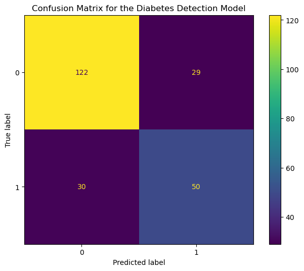
The x-axis and y-axis show the predicted and the actual output values, respectively. The counts corresponding to each outcome (ex., True Positive) are color-coded for easy comparison.
Now let’s look at an alternative approach.
Using Seaborn heatmap()
Seaborn heatmap() is my favorite way to visualize the Confusion Matrix.
You get to use seaborn’s fantastic styles and themes. And you can customize the Confusion Matrix plot to your heart’s content.
Here I’ve updated the labels and ticks for both axes to match the problem we’re trying to solve:
import seaborn as sns

# Change figure size and increase dpi for better resolution
plt.figure(figsize=(8,6), dpi=100)
# Scale up the size of all text
sns.set(font_scale = 1.1)

# Plot Confusion Matrix using Seaborn heatmap()
# Parameters:
# first param - confusion matrix in array format
# annot = True: show the numbers in each heatmap cell
# fmt = 'd': show numbers as integers.
ax = sns.heatmap(conf_matrix, annot=True, fmt='d', )

# set x-axis label and ticks.
ax.set_xlabel("Predicted Diagnosis", fontsize=14, labelpad=20)
ax.xaxis.set_ticklabels(['Negative', 'Positive'])

# set y-axis label and ticks
ax.set_ylabel("Actual Diagnosis", fontsize=14, labelpad=20)
ax.yaxis.set_ticklabels(['Negative', 'Positive'])

# set plot title
ax.set_title("Confusion Matrix for the Diabetes Detection Model", fontsize=14, pad=20)

plt.show()
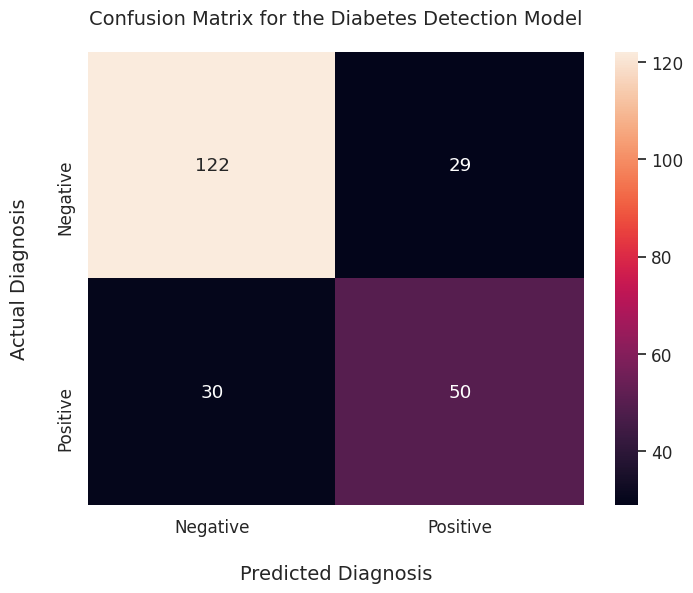
It’s quite an improvement over the raw 2D array output!
Summary & Next Steps
This post covered valuable hands-on skills to evaluate classification models. You should now be able to calculate Accuracy and plot Confusion Matrix using Scikit-Learn & Seaborn.
Here’s what you can do next to enhance your knowledge of evaluation metrics:
-
Accuracy can mislead you for certain types of classification problems. Learn how to handle such situations.
-
Now that you know basic classification metrics, you might wonder: what about regression models - how do I evaluate them? You can read about that here.
Title Image by
Louis Reed