Accuracy can be a misleading metric for certain types of classification problems.
Let's explore how Precision, Recall, and F1 Score can give a realistic view of a model’s predictive power.

This post demystifies the most common metrics used to evaluate regression models.
You'll also gain practical skills to generate these metrics using Scikit-Learn.

This post introduces you to Normal Distribution and some of its distinctive features.
You'll also learn about Empirical Rule, which dictates how values are spread in specific intervals around the mean.
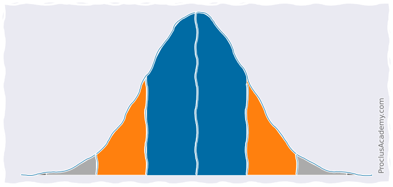
Let's explore Area Under Density Curve. What does it represent? What are some of its practical applications?
You'll also learn to plot and analyze partial areas under the curve using Matplotlib, Seaborn, and Numpy.
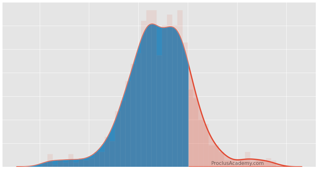
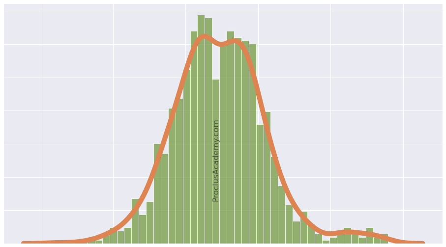
Let's explore how Data Distribution enables you to extract general patterns from the data.
You'll also learn to visualize distribution as Histogram and Density Curve using Matplotlib and Seaborn.
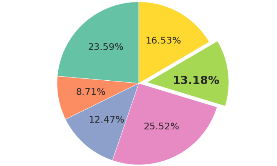
Let's explore how you can use Matplotlib to draw pie charts with customized colors and labels. You can even apply styles tailored to each slice.
Along the way, you'll see what's an exploding pie chart and how to draw it. Finally, you'll learn to plot Donut Charts!
Do you want samples that accurately represent the population? Here's how Stratified Sampling can help.
You'll also develop practical skills and learn how to do sampling using Python and Pandas.

Let's explore how to create classification datasets with balanced or imbalanced classes and binary or multiclass labels.
You can even produce datasets that are harder to classify!

Let's learn how to calculate Confusion Matrix and Accuracy using Python libraries.
I'll also show you two different ways to visualize the Confusion Matrix.

Let's look at the basic metrics to estimate a classification model’s predictive performance.
You'll also gain practical skills to generate and visualize these metrics using Scikit-Learn and Seaborn.